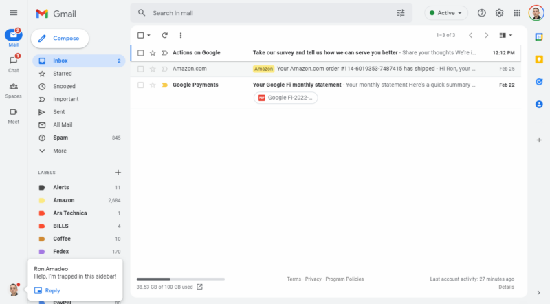
Gmail's latest redesign seems to have finally started hitting a wide number of accounts over the weekend. The new desktop site changes up the 2018 design by turning the top and side portions of the web app gray, turning the red highlight to blue, and rounding over some of the corners. Oh yeah—it also adds a big, second sidebar to the left side of the screen. The normal Gmail sidebar showing all your mail sections is still there, but now there's a whole additional sidebar that is basically an app switcher for other Google apps. It's weird.
The new colors are fine, but Gmail is theme-able anyway, so the new default design doesn't really matter much. But the new "integrated view" and sidebar will probably cause controversy. You're on Gmail.com to check your email, and now on the side of the screen, there are four new buttons. There's "Mail," which is just Gmail. Then "Chat" and "Spaces," which are both for Google's latest messaging service, Google Chat. Then there's a button for Google Meet, Google's Zoom competitor.
That's pretty much it. A top-to-bottom vertical bar to display four measly buttons (five if you count the returning hamburger button) and then a desolate Siberian wilderness of whitespace. Oh, if you happen to get an incoming Google Chat, you'll see a profile picture pop up in the abyss that is the bottom of the new sidebar. This is a huge waste of space for buttons that are irrelevant if you visit Gmail to—you know—use Gmail.
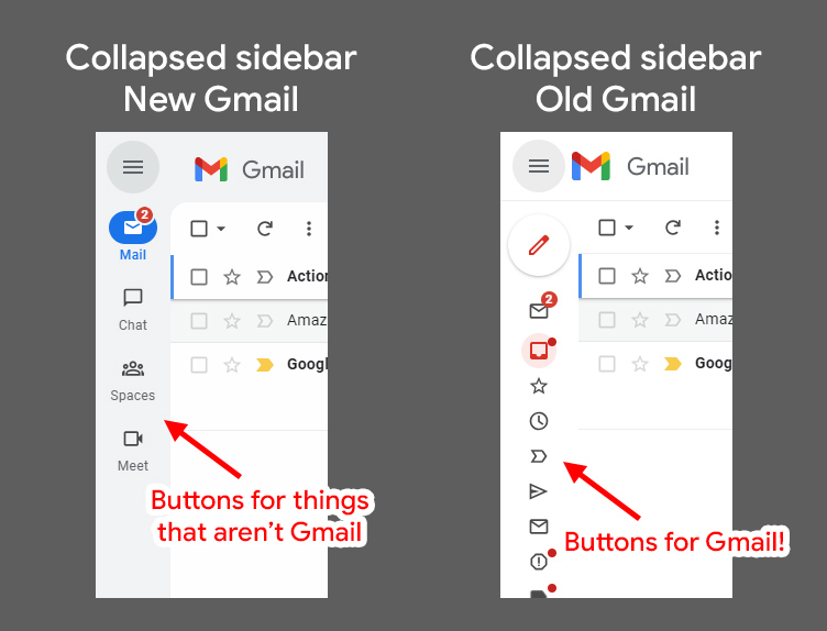
Critically, you can't collapse the new sidebar, even if you plan on never using Google Chat and Meet while you're trying to check email. The hamburger button in the top left corner looks like it might collapse the new sidebar, but it collapses the Gmail sections instead, not the app switcher. You can never make the app bar go away in the new Gmail design. Historically, you've been able to head to the Gmail settings and turn off Google Chat and Meet individually, but flipping the switch on either one of those services kicks you out of the new Gmail design and into Gmail Classic. That's going to be a problem in the future when the "classic" design goes away.
The lack of control is what really makes this app switcher a terrible addition to Gmail. The new sidebar is big, it's annoying, it's taking up screen real-estate to promote unrelated products, and I can't get rid of it. It's basically a banner ad for Google Chat and Meet.
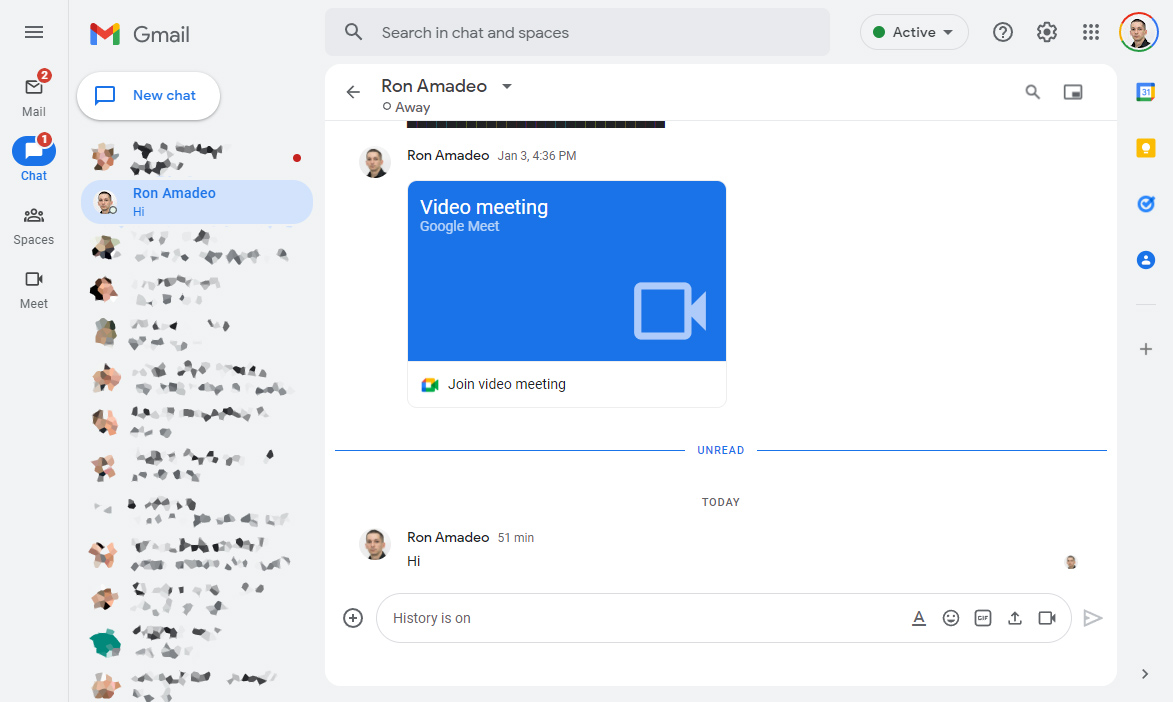
Even if you use Google Chat and Google Meet, the new Gmail buttons aren't particularly good. Google Chat made the inexplicable decision to separate one-to-one chats from group chats (or "Spaces" in the Google Chat parlance). Just like the mobile app, the new Gmail makes the critical mistake of not displaying both of these sections on the same screen. Half of your chats will be in the "Chat" section, group chats will be in the "Spaces" section, and you'll have to click to move between them. The old Gmail and the chat.google.com website show all your chats in a stacked sidebar, with group and one-to-one chats still split into separate sections but shown on a single screen. The website or old Gmail is a much nicer interface for this reason.
We've already run into bugs with Gmail's new interface. Abner Li at 9to5Google can't get the new gray color scheme to load properly on his business account, so his Gmail incorrectly displays with an all-white background. For me, the "Meet" tab doesn't do anything. Nothing happens when I click on it. Even if you could get it to open, apparently there is not much to look at. Meet's only real functions are "Join a meeting" and "Start a meeting," and even the dedicated meet.google.com website has next to no interface. All of these sidebar buttons open up giant full-screen interfaces, and what Google Meet plans to do with all that space is unclear.
Chat and video features have been part of Gmail for a thousand years now, starting with Google Talk in 2006 and Google's first video chat in 2008. On the "classic" Gmail design available today, Google Chat and Meet are already integrated with Gmail, and they are available in a way that seems like an entirely better design than this new rollout. In the classic view, there is one sidebar, with "Mail", "Chat," "Spaces," and "Meet" stacked on top of each other. Any section is collapsible, and you can dig into the settings and permanently turn off any section you don't want. Sections like Google Meet, which only has two small buttons to offer, only has a tiny sidebar section, which seems like a much more appropriate amount of space.
reader comments
118