Top 10 United Nations Logos – UN Logo Design Inspiration
Commercial and non-commercial organisations have fundamentally different objectives when designing branding materials like logos and websites. For commercial entities, the main goal is to grab consumer attention and generate profits. But non-profits are mission-driven, prioritising public welfare over revenue.
These divergent aims mean non-profits need a different design approach than commercial brands. However, starting a non-profit is similar to starting a business. It would help if you still had a clear mission, core messaging, and, most critically, an eye-catching logo to represent your organisation.
A logo is a visual symbol encapsulating an organisation's identity and values. For non-profits, the logo must communicate the social mission so it resonates with donors, volunteers, and the community served. This presents unique design challenges compared to commercial logos that sell products and services.
In the past, many viewed non-profits as less professional than corporate entities. But that perception has shifted over the years as non-profits have become more strategically run operations. With this professionalisation, non-profits require equally polished, thoughtful branding that expresses their professional approach to driving social change.
Looking at examples of successful non-profit logos can inspire designers to take on these kinds of projects. In this blog post, we'll explore the stories and design choices behind some of the most iconic logos from non-profit organisations like the United Nations. By understanding what makes these marks memorable and meaningful, designers can gain insights to create equally powerful branding for today's non-profits.
Table of Contents
Top 10 Best United Nations Logos
1: The United Nations Logo

The iconic logo of the United Nations was created in 1945 by a team of designers during the United Nations Conference on International Organization. The team was led by Oliver Lincoln Lundquist, an American architect previously working on the 1939 New York World's Fair.
The design features a world map as a circular projection surrounded by olive branches. The branches form a wreath, which symbolises peace. Using an azimuthal median projection for the world map emphasises unity and equality between nations.
The logo is rendered in just two colours – the light blue of the map representing peace and the white of the surrounding wreath connoting purity. This simple two-tone colour scheme was chosen intentionally to make reproduction uncomplicated in the days before colour printing was widespread.
Since its creation, the UN logo has universally represented the global institution and its multifaceted operations. It aims to evoke ideals of unity, security, dignity for all people, and peaceful international relations. The wreath of olive branches and the calm blue hue reflect these lofty ambitions.
The iconic design has been incorporated into the logos of various UN agencies and programs over the decades. This includes famous bodies like UNICEF, UNESCO, UNHCR, FAO, WHO, UNDP and many more. The consistency of using elements of the UN emblem ties these organisations visually to the global entity and its ideals.
Almost 80 years after its design, the UN logo remains one of the most recognisable symbols worldwide. Lundquist's simple but thoughtfully crafted image continues to visually represent the United Nations, its vision and its worldwide mission.
2: The World Health Organization Logo
The World Health Organization (WHO) is a specialized agency of the United Nations dedicated to promoting global public health. Headquartered in Geneva, Switzerland, the WHO was established on April 7, 1948, and is the successor to the Health Organization of the League of Nations.
With its unique mandate to direct and coordinate international health efforts, the WHO is leading in monitoring health trends, shaping research priorities, setting health standards, articulating evidence-based policy options, providing technical support to countries, and assessing health technologies. The WHO is governed by the World Health Assembly, which comprises representatives from the WHO's 194 member states.
The WHO logo features a map of the world enclosed in a circle, with a Rod of Asclepius symbol superimposed over the map. The Rod of Asclepius, a snake coiled around a staff, is an ancient Greek symbol of medicine and healing. This iconic imagery underscores the WHO's worldwide scope and health-oriented mission. The full name of the organisation appears next to the logo.
Since its establishment, the WHO has spearheaded efforts to eradicate diseases, promote universal health coverage, improve access to essential medicines, monitor outbreaks, coordinate responses to health emergencies, and advance health equity. Key initiatives include vaccination campaigns, tobacco control, essential medicines programs, and the International Health Regulations for preventing infectious disease spread.
With thousands of expert staff worldwide, regional and country offices, and partnerships across the public and private sectors, the WHO remains committed to building a healthier future for people worldwide. As new health challenges emerge in the 21st century, the WHO continues to adapt and evolve to safeguard global health security.
3: The World Food Programme Logo
The World Food Programme (WFP) is the leading humanitarian organisation focused on hunger and food security. Established in 1961, WFP's mission is to save and change lives by delivering food assistance during emergencies and working with communities to improve nutrition and build resilience.
Headquartered in Rome, Italy, with offices in over 80 countries, WFP is the United Nations food assistance arm. On average, WFP reaches more than 90 million people with food assistance in around 80 countries annually.
WFP focuses on emergency assistance, relief and rehabilitation, development aid, and special operations. In emergencies, WFP gets food to where it is needed, saving lives in places struck by conflict, natural disasters, and other crises. After the emergency passes, WFP helps communities rebuild shattered lives and livelihoods. It also has projects that help prevent hunger by improving food security and nutrition.
WFP is funded entirely by voluntary donations from governments, businesses, foundations and individuals. It is the largest humanitarian organisation in the world focused on hunger and food security. In 2020, WFP was awarded the Nobel Peace Prize for combatting hunger and contributing to peace during crises.
The WFP logo features an image of a hand clasping stalks of wheat and maise, surrounded by laurel leaves, similar to the UN logo. This represents WFP's mission to provide food and nutritional support to vulnerable communities. The simple, minimalist iconography aims to convey the humanitarian spirit of the organisation. Under the image is the short name “WFP” in bold letters, with the full name “World Food Programme” beside it. The logo evokes WFP's goal to take swift, meaningful action to nourish and uplift the world's hungry.
4: The International Monetary Fund Logo

In 1944, representatives from 44 countries gathered at Bretton Woods to create a plan for the post-World War II economic order. Their main goal was to prevent the recurrence of policies that could lead to further conflict.
They established the International Monetary Fund (IMF) to promote international monetary cooperation. Since its founding, the IMF has worked to maintain stability in the global financial system, which allows for exchange rates and payments to facilitate trade between countries.
The organisation also promotes high employment, sustainable economic development, and poverty reduction worldwide. It is governed by and accountable to its 189 member countries.
The IMF logo features two overlapping hemispheres of a globe surrounded by a circle. The shield shape symbolises heraldic achievement. Olive leaves below the globe represent how the IMF's lending process, like the olive fruit, requires time and strict conditions to bear fruit. The name of the organisation is written around the shield.
5: The Human Rights Council Logo

The United Nations Human Rights Council is a prominent intergovernmental body established in 2006 to promote and protect human rights worldwide. Headquartered in Geneva, Switzerland, the Council consists of 47 member states elected by the UN General Assembly for staggered 3-year terms.
The genesis of the Human Rights Council traces back to the United Nations Commission on Human Rights, which was criticised in the early 2000s for being politicised and ineffective in its mandate. After extensive negotiations, the Commission was replaced by the Human Rights Council on March 15, 2006, through UN General Assembly Resolution 60/251.
On June 18, 2007, exactly one year after its first meeting, the Council adopted its iconic logo and motto, “human rights for all.” The logo features the UN emblem of a world map framed by olive branches, with the words “Human Rights Council” in blue font circling the top. This mirrors the distinctive style of other UN bodies, with the Council's specialised focus clear through its bold name.
Over the past 15+ years, the Human Rights Council has emerged as a leading force in promoting human rights through investigations, monitoring, reporting, and recommendations to address violations. However, its membership and agenda continue to face criticisms over perceived bias, selectivity, and politicisation. The Council remains at the forefront of international efforts to uphold universal human rights principles.
6: United Nations Environment Programme Logo

The United Nations Environment Programme (UNEP) was established in June 1972 due to the United Nations Conference on the Human Environment held in Stockholm that same year. This conference, also known as the Stockholm Conference, marked the first major international meeting bringing together governments and experts to discuss global environmental issues.
Headquartered in Nairobi, Kenya, UNEP is the leading global environmental authority within the United Nations system. Its mission is to coordinate the development of environmental policy consensus by keeping the global environment under review and bringing emerging issues to the attention of governments and the international community for action.
The UNEP logo features a human figure cradled inside a circle, symbolising the organisation's global reach and impact. The laurel leaves echo the UN emblem, while the acronym UN and the words “Environment Programme” clearly identify the agency's name and mission. The minimalist, abstract design reflects UNEP's broad mandate to address environmental issues across geographical and political boundaries.
Over 50 years since its creation, UNEP continues to lead international efforts to preserve the planet's and its inhabitants' health. UNEP works to catalyse action and implement solutions to the world's most pressing environmental challenges through its research, advocacy and partnerships.
7: The International Labor Organization Logo
The International Labor Organization (ILO) was founded in 1919, growing out of 19th-century labour and social justice movements that demanded improved living standards and rights for workers worldwide. In 1946, the ILO became a specialized agency of the United Nations. With 45 member countries in 1919, ILO membership has grown to 121 nations.
The ILO has three main objectives:
- Setting international labour standards through conventions and recommendations.
- Providing technical assistance to help developing countries implement these standards and improve workplace conditions.
- Conducting research, training, and publications to advance expertise in labour issues globally.
The ILO logo features three interlocking cogwheels representing machinery, with the organization's initials inscribed inside them. The cogwheels symbolize factories and the everyday objects found within, reflecting the ILO's mission to promote decent workplaces and labour rights. Like other UN logos, the ILO version includes laurel leaves. The full name is placed next to the iconography. The colour is slightly darker than the standard UN blue.
8: The United Nations Children’s Fund (UNICEF) Logo

The United Nations Children's Fund (UNICEF), originally called the United Nations International Children's Emergency Fund, was established in 1946 as a UN program to provide humanitarian aid to children in countries devastated by World War II. After the post-war medical and food crises subsided, UNICEF continued helping vulnerable children worldwide.
During the 1970s, UNICEF expanded its role as an advocate for children's rights. In the 1980s, UNICEF assisted the UN Commission on Human Rights in drafting the Convention on the Rights of the Child. Ratified in 1989, the Convention became the most widely adopted human rights treaty in history. UNICEF played a pivotal role in promoting its implementation.
UNICEF's logo features a globe depicting a parent tenderly holding a child, representing the organisation's mission. Olive branches, a symbol of peace and hope, frame the world. The name “UNICEF” appears in lowercase lettering to the left. The iconic logo succinctly conveys UNICEF's identity as a worldwide compassionate protector and champion of children.
9: The United Nations Population Fund Logo
The United Nations Population Fund (UNFPA), previously called the United Nations Fund for Population Activities, is a United Nations program established in 1969. It is the largest international provider of support for population programs and a leading UN organisation for implementing the 1994 International Conference on Population and Development Programme of Action.
The main goal of UNFPA is to improve reproductive health, develop national strategies and protocols, and provide contraceptives and services to facilitate family planning. Recently, UNFPA has become known for its global campaign against child marriage, female genital mutilation, and obstetric fistula.
Compared to other UN logos, the UNFPA logo is quite distinctive. It features an unbroken white circle with the organisation's initials inscribed inside. On the left side of the circle, white dots form the shape of a square. The UN logo replaces one of the dots in the design, and the organisation's full name is written next to the icon.
10: International Maritime Organization Logo
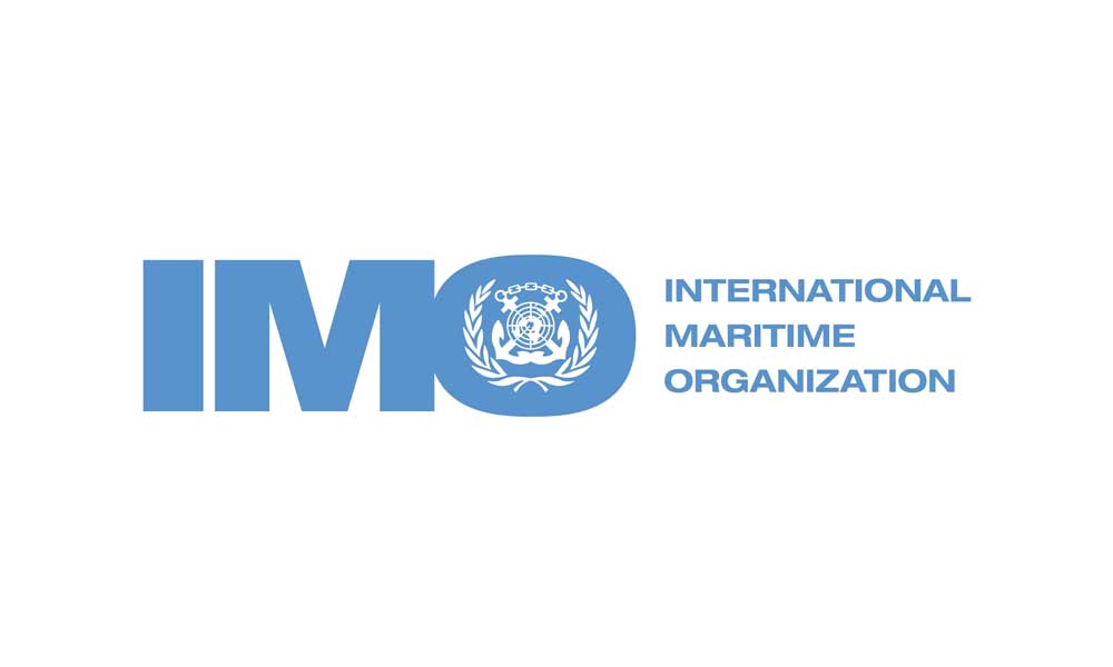
The International Maritime Organization (IMO), formerly the Inter-governmental Maritime Consultative Organization, is a United Nations specialised agency responsible for improving maritime safety and security and preventing pollution from ships.
In the mid-19th century, after certain maritime safety treaties were implemented, there was a growing need for an international regulatory body. This need took shape after the founding of the UN in 1945, and in 1948, the Inter-governmental Maritime Consultative Organization was established in Geneva.
In 1982, the organisation was renamed the International Maritime Organization.
The IMO logo features the initials of the organisation's name. The designer incorporated the UN logo inside the letter “O” to represent the IMO's relationship with the UN. Two intersecting anchors linked by a chain surround the UN logo, relating to the IMO's maritime safety and security objective. Laurel leaves a common motif in UN logos, encircling the anchors and the UN logo. The full name of the organisation is written next to its initials.
Conclusion
The United Nations logos have become an iconic symbol of international cooperation and peace. As we've seen, its design has evolved over the years, with colour, shape, and symbology variations. Yet certain key elements remain – the global projection, the olive branches, and the world map.
The logos of UN agencies also aim to encapsulate their missions and values through thoughtful design. Each symbol provides visual insight into the organisation's purpose, from the globe and wheat sheaves of the FAO to the atoms of the IAEA. The same holds for initiatives like UNICEF, UNITAR, and UNHCR, whose logos have become globally recognised.
In surveying the top 10 United Nations logos, it's clear how impactful graphic design can be. An organisation's visual identity makes an immediate impression and helps convey its principles. The UN's logos are more than just symbols – they reflect deeper meanings about our shared human experience. As the UN continues its essential work worldwide, one hopes its logos will remain compelling expressions of its vision of global unity.
