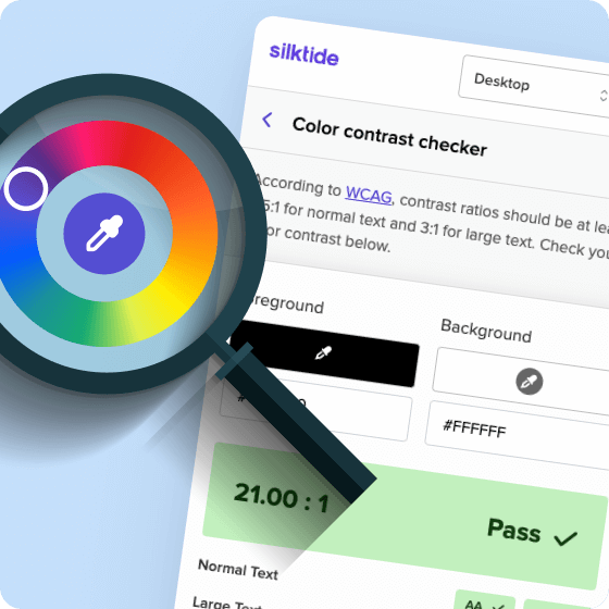
Color contrast checker
Choose two colors on your webpage and check they contrast according to WCAG guidelines
- Foreground and background color picker
- Contrast checking against the Web Content Accessibility Guidelines
- Pass/fail scoring against WCAG Level A, AA and AAA, across 20., 2.1 and 2.2
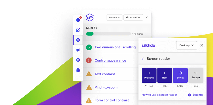
What’s included
- Check your color contrast
- FREE screen reader simulator
- WCAG and ADA compliance checker
- Disability simulations
- Keyboard navigation and focus order testing
- HTML, desktop, tablet, and mobile views
- Complete help guides for every issue found
Screen reader simulator
We made a screen reader simulator that’s as easy to use as possible.
- Experience the web as if you were blind or partially sighted
- Have the text read aloud to you
- Navigate with your keyboard or mouse
- Experience screen reader features like skipping to headings, landmarks, form elements, and more

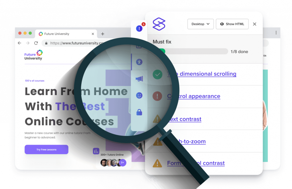
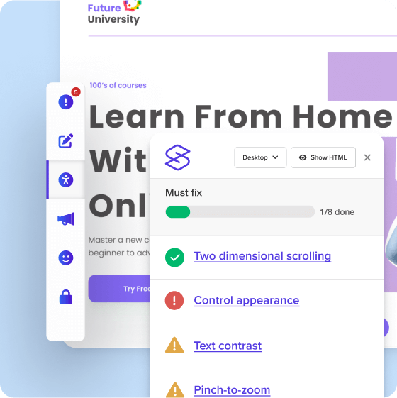
WCAG and ADA compliance checker
Understanding web accessibility can be a challenge, and issues can be hard to discover. With Silktide’s accessibility checker you can:
- Test a live or draft web page
- Find accessibility problems
- Understand how to fix them
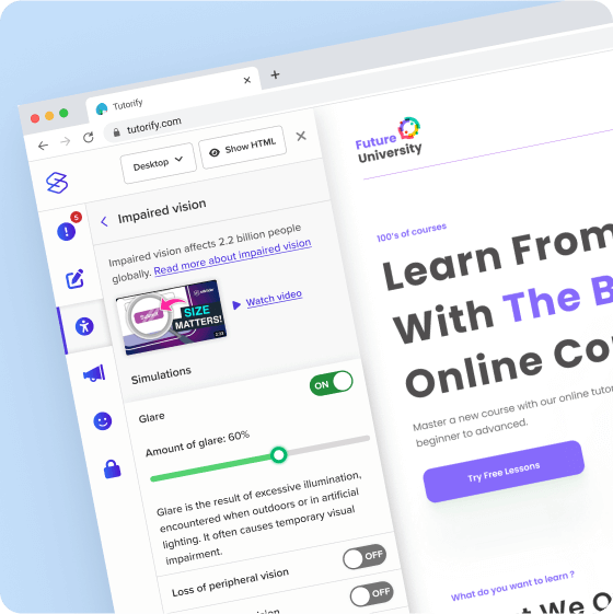
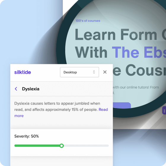
Disability simulations
Build empathy across your team by getting people to understand the impact of poor accessibility on people.
- Simulate visual impairments like color blindness, loss of color, and reduced vision
- Simulate cognitive impairments, like dyslexia
- Understand how the impact of poor accessibility affects everyone with moderate to severe disabilities
Frequently asked questions
The Silktide color contrast checker is a specific tool within the Silktide accessibility checker that evaluates the color contrast of web content. It ensures that text and interactive elements on a webpage have sufficient contrast against their background, making them accessible to people with visual impairments. This tool is key for adhering to WCAG guidelines and creating a web experience that’s inclusive for all users.
The checker is a part of the Silktide accessibility checker Chrome extension. It scans the current page in your browser, analyzing the contrast between text (or interactive elements) and their background.
The tool compares the color combinations against WCAG standards and provides a clear report highlighting any issues. You can use it by simply installing the Chrome extension, navigating to a webpage, and selecting the color contrast checker from the Silktide menu.
To get started, simply install the Chrome extension, open a web page (this can include a staging or unpublished page) and click the Silktide logo in the extensions area at the top of Chrome. Then select Color Contrast from the left-hand menu.
The color contrast checker lets you pick two contrasting colors on your website and assess them against WCAG guidelines for adequate contrast. This is essential for making sure text and interactive elements are easily readable and accessible.
Yes, it’s part of the free Silktide accessibility checker Chrome extension. It offers a detailed analysis of color contrast issues at no cost.
Definitely! It’s designed to specifically assess and report on the color-contrasting aspects of the WCAG guidelines, aiding you in achieving and maintaining compliance.
You should use it regularly, especially after any design updates that affect color schemes. Consistent monitoring ensures ongoing compliance with accessibility standards.
Yes, the Silktide color contrast checker identifies color contrast issues and suggests actionable solutions, aiding in the adjustment of your website’s color scheme to improve accessibility.
Silktide can evaluate a wide range of websites, from personal blogs to large-scale eCommerce sites. It’s versatile across different content management systems and web technologies.
It’s easy to use, offers clear explanations of contrast issues, and gives practical advice for improvement. We’ve designed it to be user-friendly, helping everyone, from beginners to experts, achieve web accessibility.
Checking your website often helps you stay compliant with accessibility standards.
For a more comprehensive solution, consider the full Silktide automated accessibility testing platform, which automates testing over thousands of web pages.
Combining automated testing with manual auditing will also give you full coverage. Find out more about Silktide’s full range of accessibility services.
Don’t worry, Silktide provides detailed help guides for every issue it finds. For color contrast issues, our guides offer clear, step-by-step advice for making the necessary adjustments.
Silktide provides comprehensive help guides for every issue it finds. If you’re still unsure, consider reaching out to a web accessibility consultant or look into Silktide’s support options.
We also have a range of free resources available, from downloadable accessibility books to comprehensive training videos on YouTube.
Color contrast is a critical aspect of web accessibility, especially for users with visual impairments. Proper contrast ensures that all users can read and interact with content effectively, making your website more inclusive and user-friendly.
Install the free color contrast checker