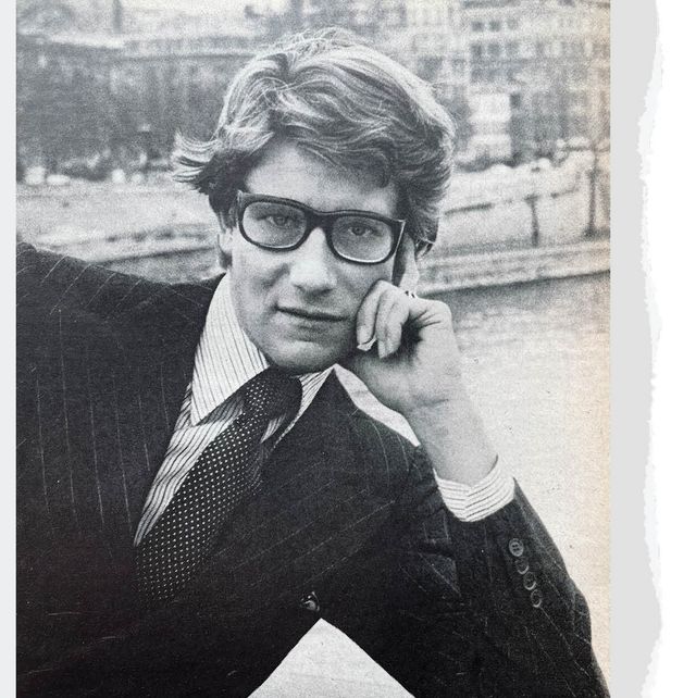
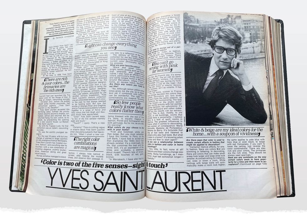
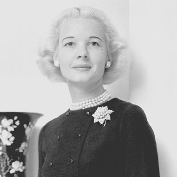
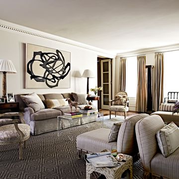
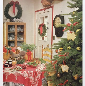
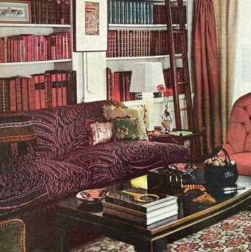
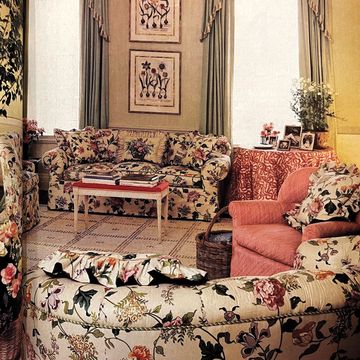
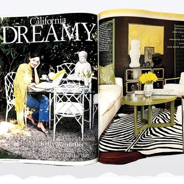
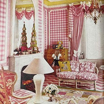
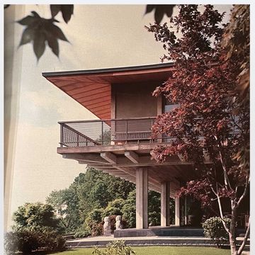
For House Beautiful’s 125th anniversary this year, we're digging into some of our favorite spaces from our archive—including, so far, decorator Sister Parish’s New York Apartment and the West Hollywood home and studio of designer extraordinaire Tony Duquette, dubbed "the house of a magician." Here, we revisit a Q&A with Yves Saint Laurent about color from 1977, which was first published in our February issue that year.
Yves Saint Laurent exploded onto the fashion scene in 1958 as the young successor to Christian Dior, after his sudden death some months prior. In the ‘60s and ‘70s, the couturier’s influence was immense. He knew the power of pantsuits for women, popularized the idea of ready-to-wear high fashion, and was a particularly skillful colorist.
Here, in our latest archive dive, we take a look back at a Q&A with Yves Saint Laurent about his color philosophy—for both fashion and interior design—in 1977. From his general belief that color is two of the five senses (sight and touch!) to the colors he chose to live with in his own homes (both in Paris and Morocco), his thoughts give insight into his expertise and chic personal preferences.
Explore the original story below.
Yves Saint Laurent is a name instantly associated with exemplary design. Here, in a rare interview, he answers questions posed by House Beautiful about his current color philosophy.
By Patrick O’Higgins
I have known Yves Saint Laurent for 18 years. Not well, however. Very few people have had the privilege. He’s an enormously private person. When we first met, he was 22—a shy, distant, reserved 22. He had the look of a scholarly, romantic 18-century seminary, a Gothic seraphim, or a wise owlet drawn by Tenniel. He still does. He was a listener rather than a talker. He still is. Introspective and distant, he was given to walking into crowded rooms sideways. He continues to do so.
At the time, in 1958, Yves Saint Laurent had just launched the Trapeze Look for the House of Dior. It was an instant, resounding success.
Christian Dior, before his sudden death some months previously, had announced publicly, “Yves Saint Laurent is my Dauphin!”
Yves Saint Laurent accepted this terrifying edict, fulfilled the proclamation beyond anyone’s dreams, collapsed, retired and returned. But he returned flying his own colors, so to speak, by proclaiming the opening of a new couture house: La Maison Yves Saint Laurent.
As with the Trapeze Look, his first collection was an instant, resounding success.
He was the world’s youngest designer.
For the next 18 years, with but one change of address to larger quarters on the prestigious Avenue Montaigne, Yves Saint Laurent has invested couture, fashion—and everything else he touches—with a rare combination of inventive elegance, youthful exuberance, theatrical daring and great visual beauty.
He has somehow managed to blend the world of Chekhov with those of Colette, of Sarah Bernhardt and Jean Harlow, of Ia Belle Époque and North African Berbers. Social extremes are his bag. Luxury is his thing. But it is a wild, romantic sort of luxury. Why shouldn’t a gypsy’s wedding dress be trimmed with sable?
Yves Saint Laurent was born 40 years ago in the shimmering but lugubrious North African city of Oran, Algeria’s second largest metropolis. “He was born with a nervous breakdown,” says Pierre Bergé, his outspoken business manager, corporate president and friend—a gimlet-eyed cyclone who somehow combines some of the characteristics of King Edward VII and Svengali.
“Pieds noir!” The metropolitan French were given to branding their North African brothers. “Black feet!” Hypersensitive, shy and tremulous young Yves Saint Laurent must have suffered acutely upon first reaching Paris. But he intended to succeed. He wanted to be the world’s greatest theatrical designer. After all, he had been born a Leo.
He has had to settle to being the world’s greatest fashion designer, purveyor of luxuries, animator, magician. Last season, stimulated by yet another nervous breakdown, Yves Saint Laurent’s couture collection was an unheralded explosion of color. In the past he had always seemed to be holding back. But now the worlds of Ghengis Khan and Diaghile and La Traviata were suddenly lumped together in a range of fierce and fiery colors that Van Gogh and Gauguin would have appreciated.
“Color” Yves Saint Laurent says, “is two of the five senses—namely sight and touch.”
“Touch?” I query. That’s a new one.
“Certainly!” There is nothing vague or evasive about Yves Saint Laurent when discussing subjects that fascinate him. “When I unveil a new collection, I always hide behind a screen, after helping the models dress, and observe their passage in front of one of the most difficult and demanding audiences on earth. One half are social and theatrical; the other is all press. At first no one seems to be paying attention to the clothes. They are all too busy examining one another. I get alarmed within myself, even frightened. Then someone leans forward to touch a dress. To feel the texture? Not really. I checked. They are drawn, as a child is to a butterfly, by color. That’s when I know I have their attention. Color, you see, is a reflection of the soul!”
The editors of House Beautiful compiled for me the following questions concerning Yves Saint Laurent’s current color philosophy. Here are his answers.
What are your favorite colors?
“Black and jewel colors—but bright, exotic jewels such as Colombian emeralds and pigeon-blood rubies. I also have an affinity to earth colors, particularly those rich browns and sandy beiges found in Morocco, around Marrakech, where I have a home, an escape hatch, Paradise!”
Are there any colors you really do not like?
“No. Although lemon yellow sometimes gives me the pip, so to speak. And yet if combined with black, it can be wonderful. The right color combinations are magical. Knowing, being blessed with the eye of how it’s done, is equally magical. In fashion, Poiret and Schiaparelli were both geniuses. As for me, as you see, I’m learning!”
What colors do you choose to live with in your home?
“First and foremost, white, and then beige. But you must remember I have two homes. In Paris, on the Left Bank, I have had to accept and then dramatize the 1930s decor that already existed. It’s a mishmash, like life, that combines the best and the worst. Still, it’s an expression of the times and, probably, a statement about myself. There’s lots of brown, black, with touches of red, gold, bronze.
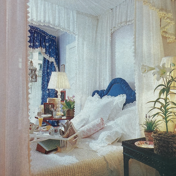
“In Marrakech, I have also had to accept and then dramatize a house that is a curious mixture of Moroccan architecture and Art Deco. They blend together beautifully. As for white and beige, my ideal colors in the home, I reserve them for the library, bedrooms and various nooks and crannies where I like to hide, to work. But even with white and beige, I favor touches of vivid color—what we call a soupcon. Lacquer in shades of aubergine; bronzes of all sorts; copper, silver and gold accessories. And flowers, and plants, of course. My favorite flower is still the lily.”
Do you tend to design out of a particular group of colors?
“Yes and no. Color, in fashion, must blend with the fashions. There are years for bright colors. There are years for muted ones. Why? C’est dans l’air, the French say, it’s something in the air. The air can be sentimental, political, military. I’ve always loved khaki. You see, during my formative years, it was all the rage—due to the war. Color in interior decoration, however, isn’t as volatile. It has to last longer.
“For the home, women in France have always decided the colors they wanted. Decorators are rare birds. We don’t have the same passion, as in America, for harmonizing. The lady of the house—or the studio apartment—works directly with her painter and her tapissier, her upholsterer. It’s all quite haphazard and rather makeshift but the results can be extraordinary. This is due, mostly, to old rooms, in old buildings, rooms that already have a personality. I believe there is a lack of such rooms in America. The greatest influences in France, when it comes to decorating, were women of consequence: Marie Antoinette, Madame de Pompadour, Madame du Barry. It’s fortunate that they all had taste and listened to artisans who also had taste. But what is taste in a home? It’s knowing when to stop and then to start again!”
Do you see a relationship between colors in fashion and color in home furnishings?
“Very little. In fact, none at all! Fashions and their colors change seasonally. Home furnishings, as I mentioned, must last somewhat longer—hopefully.”
Are there ways that color is used to create certain effects in fashion that might be applied to decoration?
“Certainly! Optical effects, for one. In fashion, there are colors that are slimming or fattening. In decorating, there are colors that can make small areas look larger and large ones look smaller. A colored ceiling, for instance, can raise or lower a room. White ceilings with beige walls will automatically make a room look higher; the same applies to pale blue with navy blue or even black, to beige with red. Conversely, if you want to lower the ceiling, just reverse the color combinations. There are also rich and poor colors. The primaries are the rich ones. They should be always used sparingly.”
Have you any comments on the way certain colors seem to have popularity for a time and then wane in acceptance?
Everyone needs a change, particularly where fashions are concerned. How else would I make my living? Decorating presents another problem. That’s why I favor what I call ‘safe’ colors—colors that keep looking fresh and don’t irritate. It’s like eating a heavy meal. You cannot do so every day. Think of living at Versailles. Small wonder they had two sets of bedrooms; one to receive in and one to sleep in. Popular colors, like popular people, are those that are enduring.”
Do you see color in any color group rising in popularity right now?
“Of course. I always do. I try, in my own way, to influence the public’s taste, but do you want to know something? The public doesn’t really need to be influenced. It invariably knows what it wants and when it wants it. My own personal forecast for 1977 is white, red, emerald green and black. But that’s for fashion. In decorating? I can only generalize by saying look once and look again before acting. Monet, when he was painting those enormous, ravishing canvases of water lilies did so for years. But first he observed them at different hours of the day, morning, noon and night. Light can change everything, you see. Certain rooms are lovely at daybreak or at dusk, in half-light or candlelight, overcrowded with furniture or virtually empty. I think that colors that enhance and freshen will continue to be popular: pale colors that match skin tones. And then, as I said earlier on, of eye-popping brilliance. Red! Lots of Chinese red.”
Apart from black and white, do you feel there are any color classics, colors that are timelessly in demand?
“Certainly. Beige and navy blue.”
Is there any color becoming to everyone?
“You cannot go wrong with pink for women, white for men. But keep it under your hat! Pink makes women, whatever age, look fresh and therefore younger. White gives men an appearance of purity and sensuality. A fatal combination.”
Do you think that people’s preferences in color are related to their coloration?
“Et comment! And how—but harmony must still exist, blend, dramatize the person. There’s an old adage that redheads look well in green. Redheads look well in purple! So few people really know what colors flatter them. The greatest mistake they can make is to wear something because it’s fashionable. The same things applies to decorating. Do the reverse to what everyone else is doing! But, even more important, do what suits you—physically, mentally, visually.”
How do you arrive at the colors you choose for your bed linen collection?
“What a relief! I never thought you would ask me. I arrive at it by a process of elimination. White is my favorite color for bed linen, freshly washed and country-aired. But there are fashions, as with everything else, for bed linen. You cannot go wrong with flowers. Stripes are always popular. Abstractions, particularly if small, seem to please. There are no set rules. I like statements. But the best critics, invariably, are overnight guests who say that they have slept well and when may they come and visit again?”
Follow House Beautiful on Instagram.
