The following assessments can be used for this lesson using the downloadable assessment rubric.
- Aesthetics 1
- Aesthetics 3
- Communication 3
- Critical thinking 1
- Critical thinking 2
- Critical thinking 4
- Historical context 4
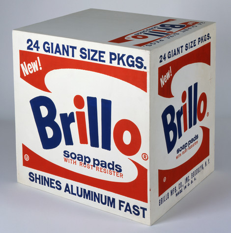
Andy Warhol, Brillo Soap Pads Box , 1964
The Andy Warhol Museum, Pittsburgh; Founding Collection, Contribution The Andy Warhol Foundation for the Visual Arts, Inc.
© The Andy Warhol Foundation for the Visual Arts, Inc.
1998.1.709
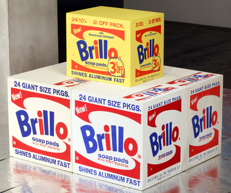
Andy Warhol, Brillo Soap Pads Box, 1964
The Andy Warhol Museum, Pittsburgh; Founding Collection, Contribution The Andy Warhol Foundation for the Visual Arts, Inc.
© The Andy Warhol Foundation for the Visual Arts, Inc.
1998.1.706-1998.1.711
In the mid-1960s, Warhol carried his consumer-product imagery into the realm of sculpture. Calling to mind a factory assembly line, Warhol employed carpenters to construct numerous plywood boxes identical in size and shape to supermarket cartons. With assistance from Gerard Malanga and Billy Linich, he painted and silkscreened the boxes with different consumer product logos: Kellogg’s corn flakes, Brillo soap pads, Mott’s apple juice, Del Monte peaches, and Heinz ketchup. The finished sculptures were virtually indistinguishable from their cardboard supermarket counterparts. Warhol first exhibited these at the Stable Gallery in 1964, cramming the space with stacked boxes that recalled a cramped grocery warehouse. He invited collectors to buy them by the stack, and, though they did not sell well, the boxes caused controversy. In reference to his boxes, Warhol later said that he “wanted something ordinary,” and it was this mundane, commercial subject matter that infuriated the critics. The perfectly blank “machine-made” look of Warhol’s boxes contrasted sharply with the gestural brushstrokes of abstract expressionist paintings.
[The boxes] were very difficult to sell. He thought that everyone was going to buy them on sight, he really and truly did. We all had visions of people walking down Madison Avenue with these boxes under their arms, but we never saw them.
Stable Gallery art dealer Eleanor Ward in David Bourdon, Warhol, 1995
A few days after the move to our [Gerard Malanga and Andy Warhol] workspace, January 28th, a truckload of wood boxes arrived, individually wrapped and taped in clear plastic sheeting. And so would begin the arduous task of taping the floor with rolls of brown paper and setting out each box in a grid-like pattern of eight rows lengthwise… Billy Name and I would take turns painting with Liquitex all six sides of each box—which numbered nearly 80—the Campbell’s tomato juice for starters, by turning each box around on its side. We waited until the paint dried. Andy and I repeated this process silkscreening all five sides again down the line. The sixth side —the bottom side—remained blank… Completing the work took nearly six weeks, from early February well into mid-April.
Warhol’s studio assistant Gerard Malanga,
Archiving Warhol: Writings and Photographs, 2002
This exercise can be repeated with a piece of music. Students create webs and then musical taste and bias lists.
As a class, discuss when we are critics in our everyday lives and how we make critical judgments about things, such as music, fashion, and movies. In their journals, students should discuss the following:
The following assessments can be used for this lesson using the downloadable assessment rubric.